Archive for the ‘Templates’ Category
Cool Looking Custom Site with Video
I often get inquiries on making a site that looks different from our regular site and here’s a good example.
This site is one of our standard sites closely based on our base template. Notice how clean and sharp it looks. It has 3 row menu bar and video integration.
Template with Custom Header and Very cool Images!
This site has a very unique header that makes the site look completely different.
The images in each of the sports pages are also very catchy. Check out the NFL image on this page:
http://wecoverthespread.com/getPicks.asp?pickData=1&nPage=1
and all the other images for each sport. Very nice indeed!
How to create your own website design
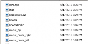
We have clients that wish to setup their own website. In order to this you need to change a set of 8 files. For the purposes of this example, I will reference the demo site system that can be found here http://demo.ezcapper.com/
The header.jpg file is 900×165 pixels and this is the main banner on the home page.
The header consists of two files wit the second file being headerBack2.jpg (900×46 pixels). This file is a tricky file as it connects the header to the menu system. More….
The second set of files comes as (notice they are all .gif files)
menu_hover_right.gif (250×46)
menu_hover_left.gif (19×46)
menu_bg.gif (2×46)
These files make up the hover menus when you put your mouse over the main menu ( “Home”, “Register”, “Access Plans”, etc. ).
The next set of files:
logo.jpg (330×95)
miniLogo.jpg (140×80)
are referenced at the following pages:
- header image of http://demo.ezcapper.com/admincontrolpanel
- right column image at http://demo.ezcapper.com/
The last image barBackground.jpg (5×22) is the color bar reference used in the “Member Login” background.
Please note the following:
- The 3 files in the hover menu set can be designed as a solid color or a semi-transparent image by making some adjustments.
- The images must be in EXACTLY the same pixel size and format (jpg or gif) in order for us to bring it to the system.
- The header set of 2 files must align exactly particularly when using an image.
- Access your admin settings and adjust the other colors in the “Edit Website Info / Settings” button.
Below I’ve attached the list of files for reference for the demo site. Click on the files twice to download.
How to keep users on your website and ensure they keep coming back!
The way to keep people on your site is to put relevant and “sticky” content on your website. What exactly is sticky content? Sticky content is content that keeps users engaged on the website and keeps them coming back on a regular basis. Keeping users coming back to your site means more sales!
At EZCapper we’ve come up with three new features.
1. Play for fun sportsbook with live betting lines
2. Live Dealer Casino with real dealers (gorgeous and sexy!)
3. Player to Player Poker coming soon!
To see how this works take a look at http://www.atsinsider.biz/ , from here click on either the Sportsbook or Live Dealer Tabs. To see the live dealer in action contact us for the passwords.
Then click on Live Games. Select your game and have some fun. This live-dealer product we are offering is totally amazing and keeps users on the site for hours.
Inquire with us on how you can get setup with these amazing add-ons.
Custom Tabs and use of iFrames
Take a look at http://www.sportshandicappingonline.com
This site has custom tabs with a private players area and the use of iframes for the Match-Ups tab.
Standard Template with Chinese Menus
This client wanted to have a Chinese theme so we translated and added Chinese fonts to his menu system and banner.
Standard Template with Login panels on left side
Although not popular this site uses our standard template with the login column moved from the right to the left.
Standard Template with Two Sports
This standard site has most of the menus removed leaving just two sports.
Custom Template without Menus
This site has removed a lot of the functionality that our standard sites have. But it’s design is elegant and refined. Not sure if this is what appeals to the mainly male demographic of the industry but it sure looks custom.
Standard Template with Menu Link to Poker
Here’s one nifty way where one site is generating income from linking to a free poker site that is actually a real money site.
Here’s another site with the second menu that is customized.
We can customize the menus upon request.


